


Top 10 Responsive Web Design Trends
3 May 2023
Responsive Website Navigation Menu
3 May 2023
In this blog, we are going to talk about color theory in responsive web design. There is one thing you might know. Color can convey mood, emotion, personality, and even influence user behavior.
Guide to Color Theory in Responsive Web Design
Now you are probably wondering many things. Like how you can choose the right colors for your website? And also how you can make sure they look good on different devices and screen sizes. That is where color theory comes in. Color theory plays a critical role in web design.
Color theory is the study of how colors interact and affect each other. As well as how they affect human perception and psychology. Color theory can help you create a harmonious and consistent color scheme for your website.
Related: Basics for Responsive Web Designs
Color theory for designers is important to understand. As well as color theory for artists. Designers use color theory to create harmonious color palettes. They can use it to communicate specific moods or emotions. They can also create emphasis and hierarchy in visual media.
On the other hand, artists use color theory to mix colors. They use it to create depth and atmosphere in paintings. They also use it to convey emotions or ideas through color. Both designers and artists can make informed decisions.
This is by understanding how colors interact with each other. And also, about which colors to use and how to use them effectively.
Color theory in responsive web design
It can also help in its usability and accessibility. In this blog post, we'll explore some of the basic principles of color theory. We will also look at how they apply to responsive web design.
Color theory in web UI design plays a crucial role. It can impact the user's perception and experience on a website. It involves understanding how colors interact with each other. And the emotions and meanings they evoke.
Color palettes can be used to create a cohesive and visually appealing design. While also considering the brand's identity and the website's purpose. Additionally, color can be used to guide users towards important elements on a page. As well as, create visual hierarchy.
Now, you might be wondering what is color in web design? Well, don’t you worry. I can answer that for you. Color in web design refers to the use of different hues, shades, and tones. This is to create a visual aesthetic and communicate information.
Colors are essential in web design as they can evoke emotions. They can also create contrast and guide the user's attention. They can be used to highlight important information. They can also create a sense of brand identity.
Web designers must consider color theory and the psychology of color. This is when they choose colors for their designs. As different colors can have different effects on the user's perception and experience. Overall, color is a powerful tool in web design. It can influence how users interact with and perceive a website.
Before we get started, we want to tell you the key concepts. These are some of the key concepts in color theory. These are all relevant to responsive web design.
- Hue: Refers to the actual color of an object. For example: red, blue, or green.
- Saturation: Refers to the intensity or purity of a color. Colors with high saturation are more vivid. While colors with low saturation appear muted or grayed out.
- Value: This refers to the brightness of darkness of a color. Colors with high value are lighter. While colors with low value are darker.
Now, the moment you have been waiting for! Time to look at how these concepts can be applied to responsive web design.
Using Color to Convey Emotion
Colors can have a significant impact on the emotional response of users. There are many different colors that can be used to create different emotional responses.
Let us give you some examples:
- Red: Red is often associated with passion, excitement, and danger. It can be used to create a sense of urgency or to draw attention. This helps to bring attention to important elements on a website.
- Blue: Blue is often associated with trust, calmness, and professionalism. It can be used to create a sense of stability and reliability.
- Green: Green is often associated with growth, health, and nature. It can be used to create a sense of freshness and renewal.
- Yellow: Yellow is often associated with happiness, optimism, and energy. It can be used to create a sense of warmth and friendliness.
Using Color to Create Contrast
Contrast is an essential consideration in responsive web design. Particularly for users with visual impairments. You must be wondering something by now. How can contrasting colors be used effectively in web design?
Well, here are some examples of how color can be used effectively in web design:
- Black and White: Black and white is a classic color combination. It provides a high contrast. It can be used to create a sense of elegance and sophistication.
- Complementary Colors: These are colors that are opposite each other on the color wheel. Such as: red and green or blue and orange. Using complementary colors in web design can create a sense of energy and vibrancy.
- Monochromatic Colors: Different shades and tints of the same color. Using monochromatic colors in web design can create a sense of harmony and cohesion.
Test and Iterate
As with any aspect of web design, it's important to test and iterate your color scheme. This is to ensure that it is effective for your target audience.
This may involve conducting user testing. Or A/B testing to see which color scheme is most effective. This helps you to figure out what is driving engagement and conversions.
For example: you may try out different color schemes for your call-to-action buttons. You can do this to see which one drives the most clicks. Testing and iterating can help to refine your color scheme. This is to make it as effective as possible.
Based on the results of your testing, you can make iterations to your color scheme. For example, you might try different shades or tones of your existing colors. This is to create a more effective color scheme. You might also try adding or removing certain colors. You might do this to see how it affects user engagement.
By testing and iterating your color scheme, you can create a website that has many pros. Such as: visually appealing, engaging, and effective. You can also incorporate user feedback and monitoring website analytics.
This will help you to refine your color scheme to make it as effective as possible. Remember, web design is an iterative process. And making small changes over time can lead to big improvements.
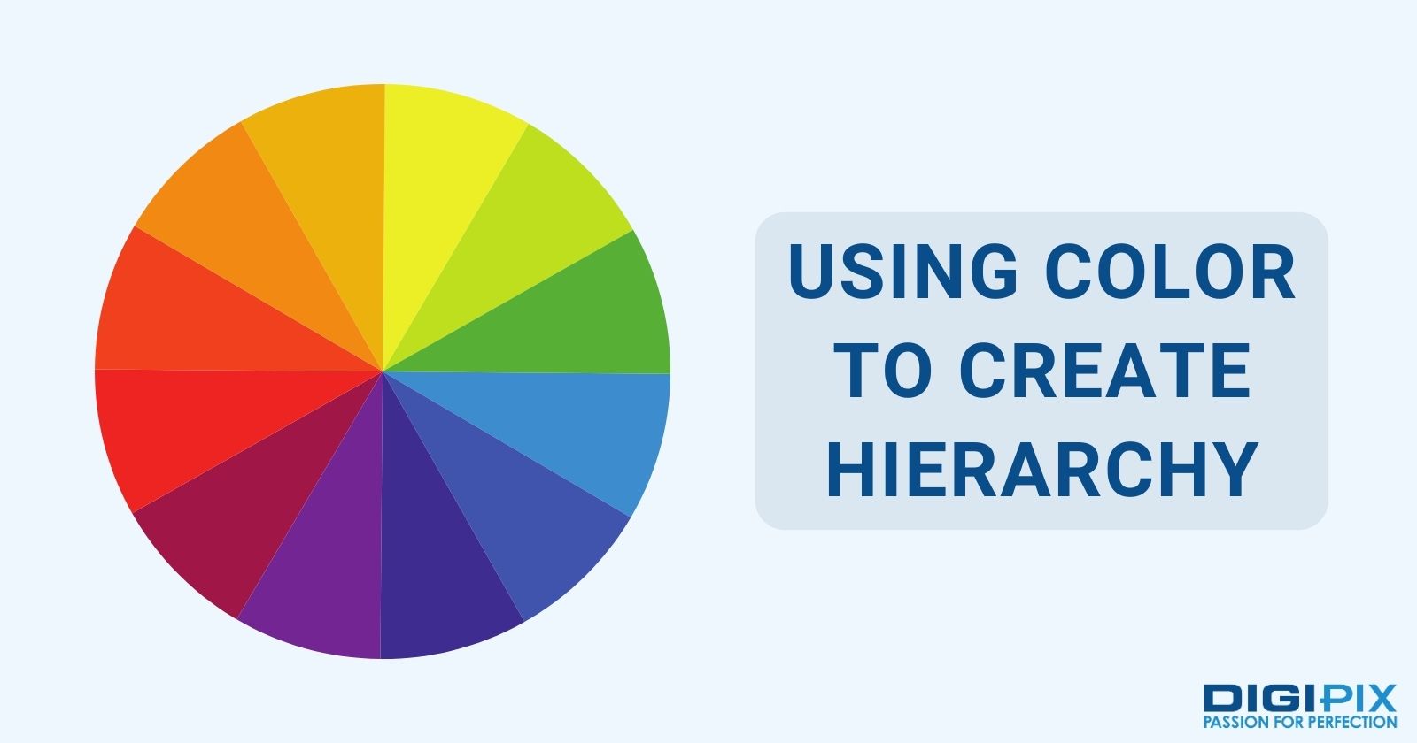
Using Color to Create Hierarchy
Color can also be used to create a sense of hierarchy on a website. These can guide users through the content and highlighting important elements.
Here are some examples of how color can be used to create hierarchy:
- Bright Colors: These can be used to draw attention to important elements. This is for a website. Such as: calls-to-action or important information.
- Neutral Colors: These colors can be used to create a sense of balance and stability. They can be used for less important elements on a website.
- Accent Colors: These colors that are used sparingly to draw attention to specific elements on a website. Such as: links or buttons.
Using Color to Create Hierarchy
Designers can create websites that are visually appealing, engaging, and effective. They can do this by using color theory. By considering all these tips, designers can create a color scheme. That color scheme can enhance the user experience and drive engagement.
Consistency
Consistency is a crucial component of effective web design. It is particularly important when it comes to using color. When a website's color scheme is consistent across all pages, let us tell you what happens. Users become more likely to feel that they are navigating a cohesive, unified experience.
Here are a few tips for maintaining consistency in your website's color scheme:
- Establish a Palette: This is before you start designing your website. It is important to establish a color palette that will guide your design decisions. This palette should include a set of colors. These colors are the ones that get used consistently throughout the website. You may choose to use a tool like Adobe to generate a palette that works well together.
- Use Color for Specific Purposes: Use color in a deliberate and purposeful way. This means using certain colors to convey specific information. Or to draw attention to important elements on the page. Let us give you an example: You might use a bright, bold color for your call-to-action buttons. This is to draw attention to them.
- Consider Color Contrast: It's important to consider the contrast. This is between the foreground and background colors. It is especially important for users with visual impairments. Who may have difficulty distinguishing between colors. A good rule of thumb is to use light text on a dark background. Or vice versa to ensure that text is legible.
- Limit the Number of Colors Used: This is to avoid overwhelming users. Stick to a few key colors in your color palette. And use them consistently throughout the website. You may choose to use different shades or tones of these colors. This is to create visual interest without adding too many new colors.
By following these tips, you can maintain consistency in your website's color scheme. This results in creating a cohesive user experience. It helps guide users through your website's content.
Context
Context is an important consideration. Especially when it comes to using color in responsive web design. The tone and purpose of your website will have a big impact. It is on how your color scheme is perceived by users.
Here are a few tips for choosing colors that are appropriate and effective for your specific website:
- Consider Your Brand Identity: Consider the personality and values. The colors you choose should align with your brand messaging. They help to convey your brand's personality. For example, a fashion brand might use bright, bold colors. This is to convey a sense of excitement and energy. While a financial brand might use more subdued, professional colors. This is to convey a sense of trustworthiness and stability.
- Consider Your Target Audience: Consider the expectations and preferences of your target audience. For example, a website targeting children might use bright, playful colors to appeal to a younger audience. While a website targeting older adults might use more muted, sophisticated colors. This is for appealing to a more mature audience.
- Consider Your Industry: Different industries may have different expectations. For example, a healthcare website might use calming, soothing colors. This is for creating a sense of relaxation and comfort. While a technology website might use bold, dynamic colors. This is to create a sense of energy and excitement. It's important to research your industry. You must understand the norms and expectations when it comes to color.
- Consider Cultural Context: Colors can have different meanings and associations in different cultures. So, it's important to consider the cultural context when choosing colors for your website. For example, in Western cultures, white is often associated with purity and innocence. While in some Eastern cultures, it is associated with mourning and funerals. It's important to research the cultural context of your target audience. This is to ensure that your color scheme is appropriate and effective.
Considering these tips, you can choose a color scheme that is appropriate and effective for your specific website. This is aligning your color scheme with your brand identity. As well as target audience, industry, and cultural context.
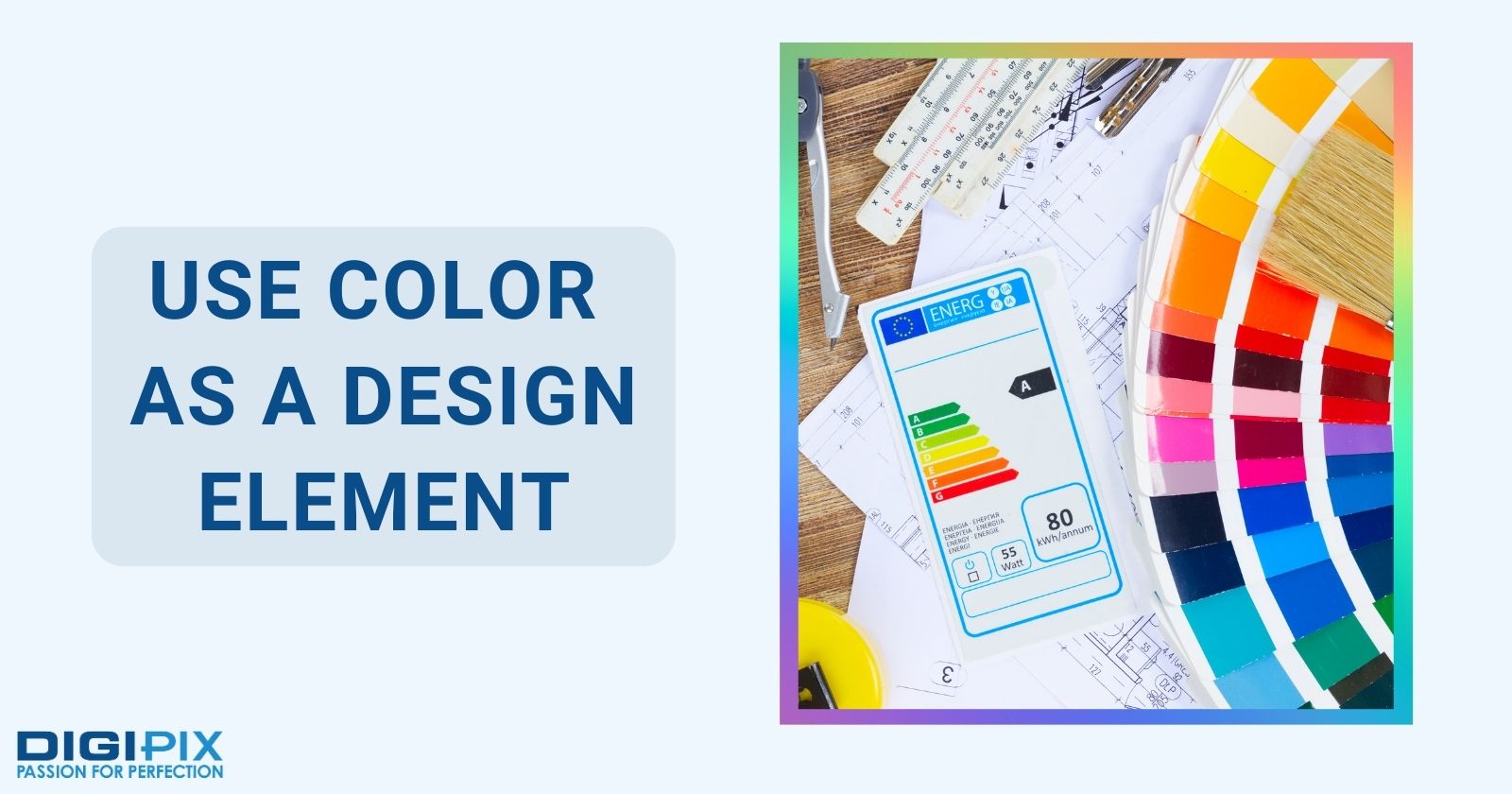
Use Color as a Design Element
This is an effective way to create a visually appealing website. And draw attention to specific elements on the page.
Here are some tips for using color as a design element in responsive web design:
- Use Color Blocking: This involves using different colored blocks or sections. It is on the page. This is done to create visual interest and draw attention to specific elements. For example, you might use a bright, bold color for your call-to-action buttons. This can help them to stand out from the surrounding content.
- Use Gradient Backgrounds: This is a great way to create a visually appealing website design. By using different shades of the same color, or different colors that blend well together. You can create a smooth, flowing background. That draws the eye and adds visual interest.
- Use Color for Navigation: This is to help guide users through your website's navigation. You might use a bright, bold color for the active page in your navigation menu. Or use different colors to indicate different sections of the website.
- Use Color to Create Emotion: Colors can have a big impact on the emotional response. You can reinforce your brand messaging and create a more engaging website experience. A healthcare website might use calming, soothing colors. They do this to create a sense of relaxation and comfort. While, on the other hand. A fitness website might use bright, energetic colors. This is to create a sense of energy and excitement.
- Use Color to Highlight Important Information: Color can be used to draw attention. It can draw attention to specific information or elements on the page. One might use a bright, bold color to highlight important information in a blog post. Or use a different color to draw attention to a sale or promotion.
Use Color as a Design Element
Incorporating these color theory principles into your responsive web design today! Through these, you can create a website that is visually appealing, engaging, and effective. Remember to consider your brand identity, target audience, and cultural context.
These are very important when choosing your color scheme. And, don’t forget to test and iterate your design over time! This is to ensure that it is effective in driving engagement and conversions.
We hope you found our blog post helpful and informative. Stay tuned for more tips and tricks on web design from DigiPix Inc.
 Written By: Khurram Qureshi
Founder & consultant of DigiPix Inc.
Call or text: 416-900-5825
Email: [email protected]
About The Author
In 2005, Khurram Qureshi started DigiPix Inc. which started off as a design agency offering video editing to professional photography, video production & post production, website designs and 3D Animations and has now expanded towards online marketing and business consultancy. Khurram Qureshi also is a motivational figure and participates in local and international platforms. He also play a role in the local community development, helping local young minds get ready to enter the job market.