Best Color Theory in Web Designing
3 May 2023
How to Optimize Speed of a Responsive Website
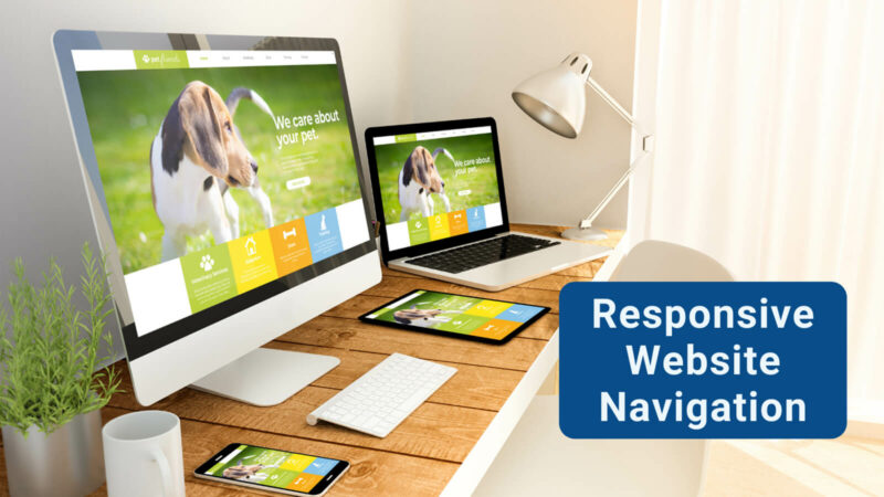
3 May 2023In the world of responsive web design, website navigation is a critical component. Now, you are probably wondering what is website navigation? Well, I will answer that for you. It is basically what can make or break a user's experience. To make your website look great and function well, you need to have responsive website navigation.
Responsive Website Navigation
Each passing day, there are more and more people accessing websites on mobile devices. This makes it essential that website navigation is easy to use and accessible on screens of all sizes.
In this blog post, we'll explore some of the most effective approaches to responsive website navigation. You are probably asking yourself many questions. Such as: “Is my website responsive?”. You might also be thinking, “What are the benefits of good website navigation?”. At the end of this blog, you will have all of your questions answered.
Also Read: How to Choose the Best Color Theory in Website Designing
Hamburger Menus
Hamburger menus have become a popular approach to responsive navigation menu in recent years. This approach involves placing a three-line icon (resembling a hamburger) in the top corner of the screen. It is like a responsive website navigation bar.
Which when clicked, reveals a slide-out menu containing the website's navigation options. Hamburger menus can be particularly effective on smaller screens. As they allow users to access the navigation menu without taking up too much screen.
Tabbed Navigation
Tabbed navigation is a simple and effective approach to responsive website navigation. This approach involves placing navigation options in a series of tabs across the top. Or bottom of the screen.
This approach can be particularly effective on larger screens. As it allows users to easily see all of the available navigation options.
However, on smaller screens, tabbed navigation can become crowded and difficult to use. Particularly if there are a lot of navigation options.
In addition, tabbed navigation may not be the best choice for websites with a lot of content. Or multiple levels of navigation.

Tabbed Navigation
Mega Menus
Mega menus are a popular approach to responsive website navigation. This is for websites with a lot of content or multiple levels of navigation. This approach involves displaying a large menu.
This menu contains multiple navigation options and sub-options. This works when a user hovers over a main navigation option. Mega menus can be particularly effective for e-commerce websites. As they allow users to quickly and easily find the products or categories they're looking for.
Dropdown Menus
Dropdown menus are a simple and effective approach. This approach involves displaying a list of navigation options in a dropdown menu. It is when a user clicks or hovers over a main navigation option.
Dropdown menus can be particularly effective for websites with multiple levels of navigation. As they allow users to easily access sub-navigation options.
Sticky Navigation
Sticky navigation is a popular approach to responsive website navigation. It involves keeping the navigation menu fixed. At the top or bottom of the screen as a user scrolls down the page. This approach can be particularly effective on longer pages.
As it allows users to access the navigation menu at any time. This is without having to scroll back to the top of the page.
In conclusion, there are several effective approaches to responsive website navigation. You should consider the needs of your users and the content of your website. These approaches to navigation provide a user-friendly and accessible experience on screens of all sizes.
Related: How to Optimize Speed of a Responsive Website
We hope you found our blog post helpful and informative. Stay tuned for more tips and tricks on web design from DigiPix Inc!

Founder & consultant of DigiPix Inc.
Call or text: 416-900-5825
Email: [email protected]
About The Author
In 2005, Khurram Qureshi started DigiPix Inc. which started off as a design agency offering video editing to professional photography, video production & post production, website designs and 3D Animations and has now expanded towards online marketing and business consultancy. Khurram Qureshi also is a motivational figure and participates in local and international platforms. He also play a role in the local community development, helping local young minds get ready to enter the job market.


