


Basics for Responsive Web Designs
3 May 2023
Best Color Theory in Web Designing
3 May 2023
Responsive web design is a must-have. It is for any website that wants to provide a great user experience. This is across different devices and screen sizes. But what are the latest responsive web design trends in this field?
Guide to Responsive Web Design Trends
Responsive web design has become increasingly important in recent years. As more and more people access the internet on their mobile devices.
There is a high growing popularity of smartphones and tablets. It is essential for websites to be designed with responsiveness in mind.
In this blog post, we'll explore some of the latest trends in responsive web design. They range from innovative layouts to new approaches to navigation and user experience.
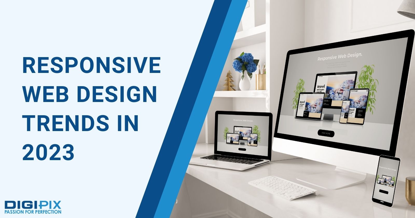
Responsive Web Design Trends in 2023
Dark Mode
Dark mode is not a new concept. But, it has become more popular and widely adopted in recent years. Dark mode is a feature that allows users to switch the color scheme. It is for a website or app from light to dark, or vice versa.
This can help reduce eye strain, and save battery life. It can also create a more immersive and elegant aesthetic. Many websites and apps now offer dark mode as an option. Or even as a default setting.
Which depends on the user's preference or system settings. Some examples of websites that use dark mode are: YouTube, Twitter, Reddit, and Medium.
Interactive Elements
Interactive elements are becoming increasingly popular in web design. Particularly in the context of mobile devices. These can include things like animated buttons, interactive menus, and hover effects.
Interactive elements can help to create a more engaging user experience. They make it easier for users to navigate and interact with a website.
Some of the key features of interactive web design include:
- Engaging user experience: Helps in creating a more engaging user experience. This makes it easier for users to navigate and interact with a website.
- Use of animations and transitions: Animations and transitions are really helpful! They can help to create a sense of movement. This makes a website feel more dynamic and engaging.
- Microinteractions: These are small, targeted interactions. These help users accomplish specific tasks on a website. These can include: confirmation messages, loading animations, and error messages.
Many famous websites use interactive web design. For example: Nike, Google, Dropbox.
Related: Best Ecommerce Website Designs
Fluid Typography
Typography has always been an important aspect of web design. However, it's becoming even more so in the context of responsive design. There are more and more users accessing websites on small screens.
Designers need to pay close attention to font sizes and spacing. This is to ensure that text remains legible and easy to read.
Fluid typography is a technique that allows the font size and line height of text. This is done to adapt to the viewport width. Rather than using fixed values or breakpoints. This can create a more harmonious and balanced layout. As well as improve readability and accessibility.
Some of the key features of typography in responsive web design include:
- Use of responsive fonts: Responsive fonts are designed to scale automatically. They are based on the size of the screen. This can help to ensure that text remains legible. And easy to read on small screens.
- Clear hierarchy: Typography should be used to create a clear hierarchy. This is on a website. It is with headlines and subheadings helping to guide users through the content. This can help to make it easier for users to find the information they're looking for. It can make a website feel more organized and coherent.
- Consistency: Typography should be consistent across a website. It should be with the same fonts and styles – used consistently throughout. This can help to create a sense of unity and coherence. It can also make a website feel more professional and polished.
Fluid typography can be achieved using CSS variables. For example: calc() function, viewport units, or custom properties. There are many websites that use fluid typography. They include: Airbnb, Spotify, and The New York Times.
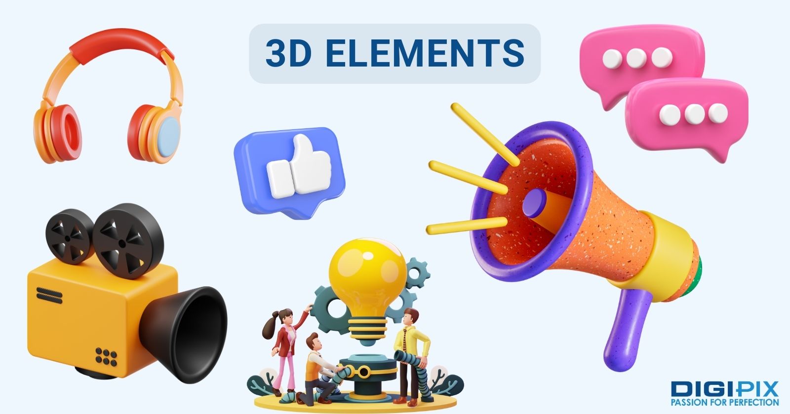
3D Elements
3D elements can add depth, realism, and interactivity to a website. This helps in creating a more engaging and memorable user experience. 3D elements can be created using various technologies.
Such as: WebGL, Three.js, CSS transforms, or SVG animations. 3D elements can be used for various purposes. This included showcasing products, telling stories and creating illusions.
And, it doesn’t just stop there! One can also add fun and playful effects. Numerous different websites use 3D elements. For example: Apple, Nike, and Bruno Simon.
3D Elements
Navigation
Navigation is a critical aspect of web design, particularly on mobile devices. As days go on, more and more websites move towards a mobile-first approach. Designers are experimenting with new approaches to navigation.
Such as: hamburger menus and slide-out menus. These can be particularly effective for websites that have a lot of content. As they allow users to quickly and easily navigate through the site.
Some of the key features of navigation in responsive web design include:
- Use of simple menus: Menus should be simple and easy to use. They should be with clear labels and intuitive navigation. This can help to make it easier for users to find the information they're looking for. Regardless of the device they're using.
- Use of icons: Icons can be used to help users quickly identify different sections. These are for a website. They can make it easier for users to navigate through a site on small screens.
- Use of responsive navigation: Navigation should be responsive. This means that it should adapt to different screen sizes and devices. This practice can help to ensure that users can navigate a website easily. It should be regardless of the device they're using.
Many websites use effective navigation in responsive web design. These include: Amazon, Airbnb, and Asana.
Minimalism
Minimalism has been a trend in web design for a while now. And, it’s still going strong! Minimalist design is particularly well-suited to responsive websites. S it allows for a clean and simple layout. This helps for it to adapt to different screen sizes.
Minimalism is a design philosophy that aims to reduce clutter and complexity. It aims to focus on the essential elements and content. Minimalism can help improve the loading speed and performance.
It also helps in improving the usability, and aesthetics of a website. Minimalism can be achieved by using simple colors, shapes, fonts, and icons. As well as removing unnecessary elements. Such as: borders, shadows, gradients, or animations.
Some of the key features of minimalist web design include:
- Plenty of whitespace: One of the many defining characteristics of minimalist web design. It is the use of whitespace.This can help to create a sense of clarity and simplicity. This can make it easier for users to focus on the most important elements of a page.
- Simple color schemes: Minimalist web design tends to use simple color schemes. It often consists of just two or three colors. This can help to create a sense of unity and coherence across a website.
- Simple typography: Typography tends to be simple and easy to read. This can help to create a sense of clarity. It can make it easier for users to read content on small screens.
Some examples of websites that use minimalism are Stripe, Dropbox, and Google.
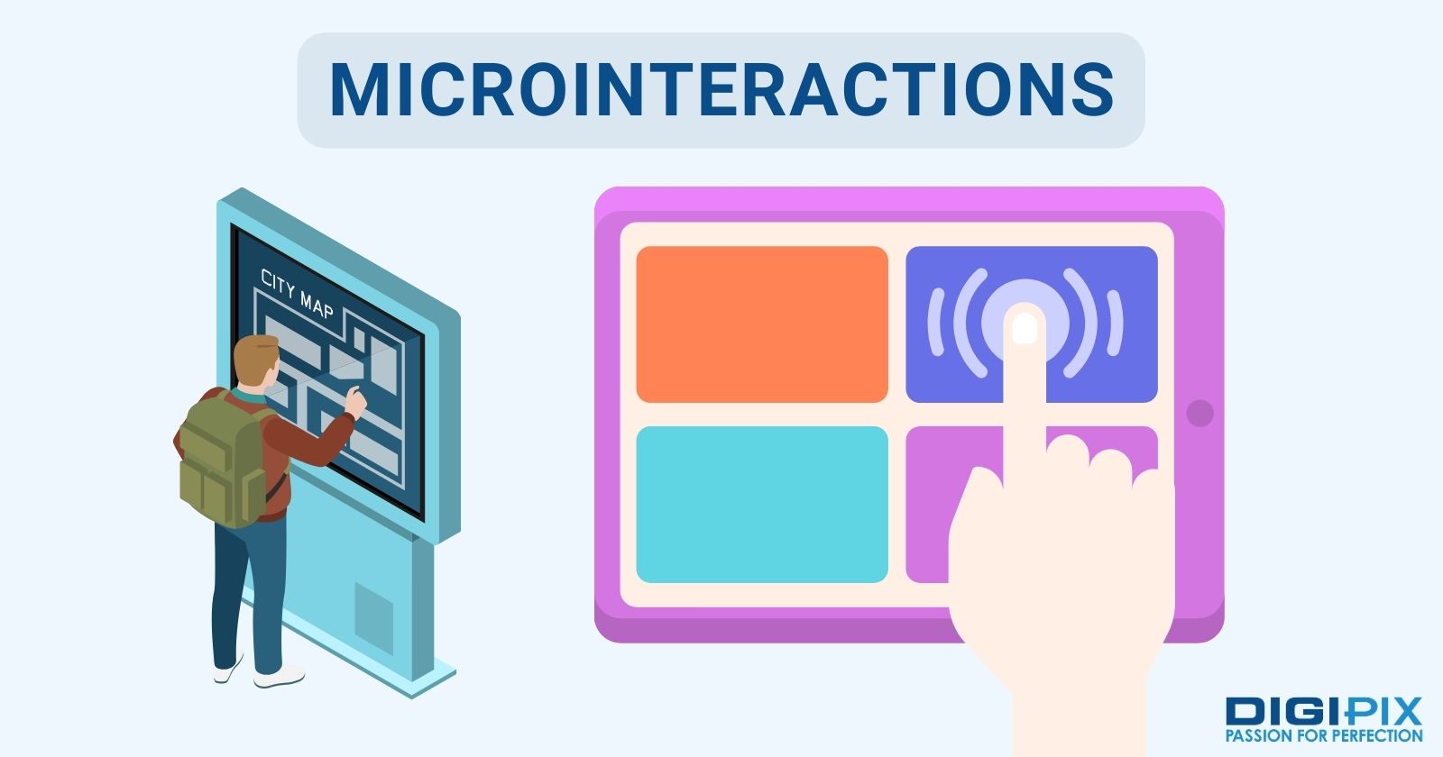
Microinteractions
Microinteractions are small and subtle animations or feedback. They occur when a user interacts with a website or app. Microinteractions can enhance the functionality, and usability. They can also delight in a website or app.
Microinteractions can be used for various purposes. Such as: indicating status, providing guidance, confirming actions, or rewarding users.
Microinteractions can be created using CSS transitions. For example: keyframes, or JavaScript libraries. Some examples of websites that use microinteractions are: Dribbble, Slack, and Netflix.
Micro interactions
Split-Screen Layouts
Split-screen layouts have been gaining popularity in recent years. Particularly in the context of mobile devices. This layout involves dividing the screen into two or more sections.
Each of these contains different content. This approach can be particularly effective for websites. It is for those who want to showcase multiple products or services.
Some of the key features of split-screen layouts include:
- Clear visual separation: One of the key features of split-screen layouts. It is the clear visual separation between different sections of the screen. This can help to create a sense of order and hierarchy. It can make it easier for users to navigate through a website.
- Use of contrasting colors: Split-screen layouts often use contrasting colors. This is to help differentiate between different sections of the screen. This can help to create a sense of visual interest. It can also make it easier for users to identify different elements on the page.
- Use of images and icons: Split-screen layouts often use images and icons. This is done to convey information. This creates a sense of visual interest. This can help to break up text-heavy pages. It can make it easier for users to navigate through a website.
There are many websites that use split-screen layouts. These include: Airbnb, Squarespace, and Trello.
Accessibility
Now, it is time for us to tell you about the most crucial consideration! Accessibility. Accessibility basically ensures that websites can be accessed and used by as many people as possible. This is regardless of their abilities or disabilities.
There are many key considerations when it comes to accessibility. We have made a list of them:
- Use of Alt Text for Images: Alt text is a description of an image. This appears in place of the image if it cannot be displayed. This is important for users with visual impairments. These users may be using assistive technologies like screen readers. Through this, designers can ensure that all users can understand the content of a website.
- Uses of Headings and Semantic Markup: This can help to create a clear hierarchy on a website. It helps in making it easier for users with cognitive or visual impairments. This can help these users to navigate through the content. Using these, designers can ensure that all users can access and understand the information on a website.
- Keyboard Accessibility: Keyboard accessibility is important for users. This is for those who cannot use a mouse or trackpad to navigate a website. It is done by ensuring that all website elements can be accessed and interacted with. It is implemented using just a keyboard. Designers can ensure that all users can navigate a website easily.
- Color contrast: This is very important for users with visual impairments. As it can affect their ability to read text and understand content. One must ensure that there is sufficient contrast between text and background colors. Designers can ensure that all users can read and understand the content on a website.
- Use of Descriptive Link text: This should be descriptive. It should provide users with a clear understanding of where a link will take them. This is important for users with cognitive or visual impairments. And who may rely on link text to understand the content of a website.
And, don’t you worry! We have also found some websites that consider accessibility to inspire you. These websites include: BBC, The National Institute of Health, CDC, etc…

Website Speed
Website Speed
Site speed is another important consideration in responsive web design. A fast-loading website is not only more user-friendly. But, it can also improve search engine rankings and conversion rates.
Some key considerations when it comes to fast site speed in responsive web design include:
- Image Optimization
- Minification of HTML, CSS and JavaScript
- Use of a Content Delivery Network (CDN)
- Use of Caching
- Reduction of HTTP Requests
By focusing on site speed in responsive web design, designers can create websites that not only look great. But that also provides a fast and user-friendly experience for all users.
Responsive vs. Adaptive Web Design
Responsive and adaptive web design are two different approaches. They are used to create websites that can adjust to various screen sizes and devices. Responsive design uses flexible grids, images, and CSS media queries. That is done to adapt the layout and content of a website to different screen sizes.
On the other hand, adaptive design uses predefined layouts. These are specifically designed for screen sizes. In responsive design, the website responds to changes in screen size and orientation. While adaptive design detects the device and delivers the appropriate layout.
Both approaches have their advantages and disadvantages. It ultimately depends on the project's goals, budget, and target audience. This is to determine which approach is best suited for the project.
These are some of the most exciting and innovative responsive web design trends that you should know about. We hope you enjoyed reading this blog post and learned something new!
If you have any questions or comments, feel free to reach out. Stay tuned for more tips and tricks on web design from DigiPix Inc!
 Written By: Khurram Qureshi
Founder & consultant of DigiPix Inc.
Call or text: 416-900-5825
Email: [email protected]
About The Author
In 2005, Khurram Qureshi started DigiPix Inc. which started off as a design agency offering video editing to professional photography, video production & post production, website designs and 3D Animations and has now expanded towards online marketing and business consultancy. Khurram Qureshi also is a motivational figure and participates in local and international platforms. He also play a role in the local community development, helping local young minds get ready to enter the job market.