


Different Types of Website Security Risks
9 September 2022
Best Practices to Optimize Website for all Screen
9 September 2022
It is no secret that the world of web design is constantly changing. What was once cutting-edge and modern can quickly become outdated. In order to keep up with the competition, it is important to ensure that your website is as responsive as possible.
In this article, we will look at some tips and tricks for making your website design more responsive, so you can stay ahead of the curve.
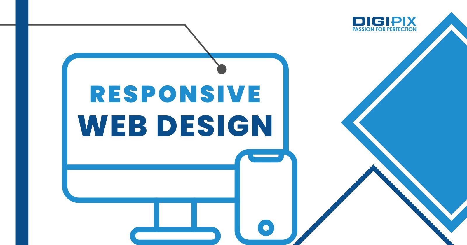
How to Make Your Website Design Responsive
One of the most important things to consider when making your website design responsive is your layout. Many people make the mistake of using fixed-width layouts. This can look great on desktop screens but tend to break down when viewed on smaller devices like smartphones and tablets.
Instead, try using a fluid or elastic layout that will automatically adjust to fit any screen size. This will ensure that your content looks good no matter what device it is being viewed on.
Another thing to keep in mind when creating a responsive website design is font size. Many people make the mistake of using small fonts which are difficult to read on smaller screens.
Instead, use larger fonts which will be easier to see and navigate. You may also want to consider using different fonts for different screen sizes; for example, you could use a serif font for desktop screens and a sans-serif font for mobile devices.
In addition to your layout and font size, another important aspect of responsive website design is your content. When creating your content, it is important to keep in mind how it will look on different screen sizes
For example, if you have a lot of text on your site, you may want to consider using shorter paragraphs or bullet points so that it is easy to scan on smaller screens. Conversely, if you have large graphics or videos on your site, you will need to make sure that they are sized appropriately so that they do not take up too much space on smaller devices.
Finally, one of the most important things to remember when creating a responsive website design is testing. It is important to test your site on as many different devices as possible, so you can see how it looks and functions on each one. This will help you identify any potential problems so that you can fix them before they cause your site to break down.
Furthermore, here are five simpler ways to make your website design responsive:
Use a responsive template or framework
A responsive template or framework is a great place to start when creating a responsive website. These templates automatically adjust the layout of your pages based on the size of the screen being used to view them.
This takes out much of the guesswork and makes designing for different devices much easier. There are many free responsive templates available online; just do a search for "responsive templates."
Use media queries
Media queries allow you to customize the look and feel of your website based on the width of the screen being used to view it. For example, you can use media queries to change the font size, line height, and other aspects of your design based on whether someone is viewing your site on a phone, tablet, or computer monitor.
Use flexible images and videos
Many images and videos are displayed in a fixed width, which can cause them to look distorted on smaller screens. To prevent this, you can use flexible images and videos. Flexible images are images that adjust their width automatically.
It is based on the width of the screen being used to view them. You can achieve this by using the max-width property in CSS. For videos, you can use a responsive embed code, which will also adjust the width of the video automatically.
Use fluid grids
Grids are an important part of web design, but they can be tricky to make responsive. That is because the widths of elements must be specified in pixels, which do n.t resize automatically.
However, there is a solution: fluid grids. Fluid grids use percentages instead of pixels to specify the widths of elements, so they resize automatically. This makes it much easier to create responsive designs.
Use responsive typography
Another important aspect of responsive design is typography. When the width of a screen changes, the text must adjust accordingly so that it is still legible and easy to read. There are two ways to achieve this: using media queries (as mentioned above) and using relative font sizes.
Relative font sizes allow you to specify the size of text in relation to the overall size of the website, so they adjust automatically when the width of the site changes.
By following these tips, you can create a responsive website design that will work well on all types of devices. By keeping your layout and content in mind, you can ensure that your site looks great and functions properly no matter what device it is being viewed on. And by testing your site regularly, you can stay ahead of the curve and keep your visitors happy.
Using HTML and CSS
Creating a responsive website using HTML and CSS involves a number of steps. You'll need to make use of fluid grid layouts, flexible images, media queries, and more. Here's a basic guide on how to make your website responsive:
- Set the Viewport
Start by adding the viewport meta tag in thesection of your HTML document. This controls the width and scaling of the page on different devices.
HTML code
- Fluid Grid Layouts
Instead of setting widths in pixels, use percentages. This allows your layout to resize relative to the screen size.
CSS code
.container {
width: 100%;
}
- Flexible Images
To ensure that images scale nicely, set the max-width property of the image to 100% in your CSS.
CSS code
img {
max-width: 100%;
height: auto;
}
- Media Queries
Media queries in CSS allow you to apply different styles for different screen sizes. Define breakpoints where your layout needs to change. Common breakpoints are 600px (for phones), 768px (for tablets), and 1024px (for laptops and desktops).
CSS code
@media screen and (max-width: 600px) {
.container {
background-color: blue;
}
}
Related: How To Create a Responsive Website Navigation Menu
- Responsive Navigation
If your website has a navigation menu, make sure it's also responsive. On smaller screens, consider using a dropdown menu or a hamburger icon.
CSS code
@media screen and (max-width: 600px) {
.navbar {
display: none;
}
.menu-icon {
display: block;
}
}
- Typography
Ensure text is readable across all devices. You might need to adjust font size or line spacing at different breakpoints.
CSS code
@media screen and (max-width: 600px) {
body {
font-size: 18px;
}
}
Remember to test your website on various devices and screen sizes to ensure that it's fully responsive. There are also many online tools available that can help you visualize how your website looks on different devices.
 Written By: Khurram Qureshi
Founder & consultant of DigiPix Inc.
Call or text: 416-900-5825
Email: [email protected]
About The Author
In 2005, Khurram Qureshi started DigiPix Inc. which started off as a design agency offering video editing to professional photography, video production & post production, website designs and 3D Animations and has now expanded towards online marketing and business consultancy. Khurram Qureshi also is a motivational figure and participates in local and international platforms. He also play a role in the local community development, helping local young minds get ready to enter the job market.
Related Blogs
As technology advances, more and more people…

Are you in the process of creating a website…

You may be wondering if you even need web…
Website security risks come in all shapes…