


Benefits of 3D Augmented Reality for Real Estate Business
9 September 2022
Benefits of Web Development for Businesses
9 September 2022
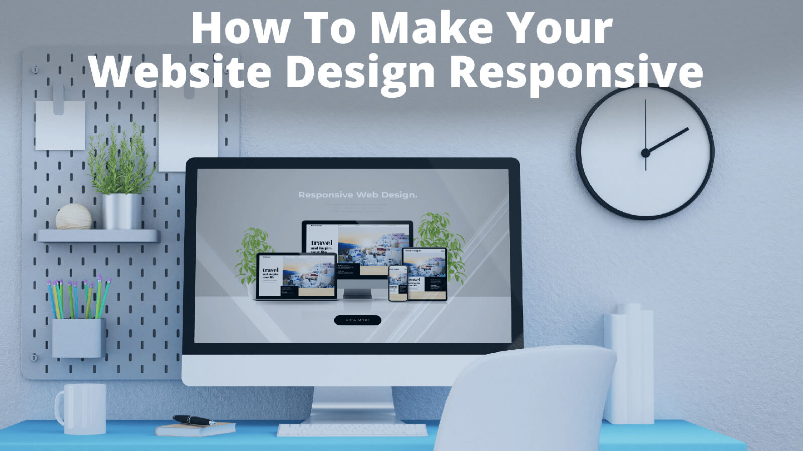
More and more people are using mobile devices to access the web, and if your website does not look good on a phone or tablet, you are going to lose business.
That is why responsive web design is so important. A responsive website will reformat itself automatically to fit any screen size. It will make it look great no matter what device your customers are using. But that is not the only benefit of responsive design.
What is the Purpose of Responsive Web Design?
Improved User Experience: The primary purpose of responsive web design is to create a smooth, intuitive user experience regardless of the device being used. Responsive design ensures that users do not have to pinch, zoom, or scroll excessively to view content on smaller screens, making navigation easier and more intuitive.
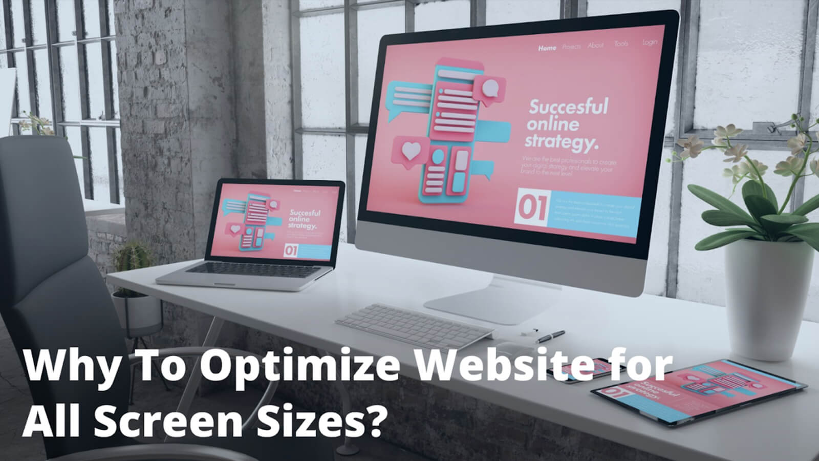
Increased Mobile Traffic: As more people use smartphones and tablets to browse the internet, a responsive design ensures that your website is accessible and user-friendly on these devices. This can increase mobile traffic and engagement.
Related: How to Make Website Design Responsive
Improved SEO: Search engines like Google prioritize mobile-friendly websites in search results. A responsive design can improve your site's search engine ranking, making it easier for potential customers to find you.
Reduced Maintenance and Cost: Managing separate versions of a website for desktop and mobile devices can be time-consuming and costly. Responsive design uses a single code base that works across all devices, simplifying maintenance and potentially reducing costs.
Faster Web Pages: Responsive websites typically load faster on all devices, especially mobile ones, enhancing the user experience and potentially improving your site's search engine ranking.
Future Proofing: As new devices (with potentially different screen sizes and resolutions) come onto the market, a responsive website will still look and function well, making it a future-proof solution.
Increased Conversion Rates: A website that provides a seamless user experience across all devices can lead to higher conversion rates, as users are more likely to take desired actions (like making a purchase or signing up for a newsletter) when the process is straightforward and hassle-free.
7 Benefits of Responsive Web Design
The purpose of responsive web design is to ensure that your website is accessible, user-friendly, and effective across all devices. Now that we have looked at the purpose, let us get down to the advantages!
1) Increased Mobile Traffic:
According to recent studies, more than 50% of all internet traffic now comes from mobile devices. If your website is not optimized for mobile users, you are losing out on a lot of potential business.
With a responsive design, you can make sure that all of your visitors have a positive experience no matter what device they are using. More and more people are browsing the internet via their mobile devices.
Having a responsive website is essential. It is for ensuring that all visitors can access your content. That is without having to struggle with navigating an unresponsive site.
2) Improved Experience:
A bad user experience can ruin your reputation and cost you sales. Responsive design creates a smooth and consistent experience across all devices. Improving customer satisfaction and reducing abandonment rates.
It improves user experience. It ensures that no matter what device a person is using to view a website, the layout will be optimized for their screen size. This makes websites easier to navigate and eliminates the need to resize or scroll around on the page.
3) Reduced Costs:
Creating separate versions of your website for different devices can be expensive. It is also time-consuming. One of the biggest benefits of responsive web design is that it can dramatically reduce development and design costs.
Because a single layout can be used for all devices, you do not have to create separate layouts for each device type. Which can save a lot of time and money. In addition, using flexible images means you do not have to create many versions of each image, saving even more time and money. Finally, using media queries.
You can target specific devices and tailor the design to best suit their capabilities. This allows you to provide an optimal user experience on every device, regardless of its size or capabilities.
4) Increased Sales:
A responsive website is key to providing a positive user experience, which is essential for driving sales and conversions. If your website is difficult to navigate or does not look good on mobile devices, you are likely to lose customers and see a decrease in sales.
A study by Google found that 61% of users are unlikely to return to a website if it is not mobile-friendly. Responsive design makes sure your website looks good and is easy to use. It is for any device, which can encourage more people to stay longer on your site, and even make a purchase.
5) SEO Benefits:
Google now penalizes websites that are not optimized for mobile devices. So, if you want to rank well in search results, you need to make sure your site is responsive.
Responsive design can also help improve your click-through rates and organic search traffic. As mobile users are more likely to click on links that are easy to navigate and read on their device.
6) Enhanced Branding:
Your website is often the first interaction customers have with your brand, so it is important to make a good impression. Responsive web design enhances branding. That is because it allows businesses to create a single, cohesive website. that looks great and functions well on any device.
With responsive design, businesses can target users with different screen sizes and devices. It gets done without having to create multiple websites or mobile apps. This helps to maintain a consistent branding message across all channels. Which can improve customer loyalty and encourage repeat visits.
7) Future-Proof:
With more and more people using mobile devices to access the web, responsive design is no longer optional – it is essential. By investing in a responsive website now, you can future-proof your business. You can make sure that you are able to meet the needs of your customers as technology evolves.
Responsive web design is no longer optional – it is essential. By investing in a responsive website now, you can future-proof your business. You can also make sure that you are able to meet the needs of your customers as technology evolves.
So if you are not already using responsive design for your website, now is the time to make the switch. Contact us today to learn more about how we can help you create a responsive site that will help grow your business.
 Written By: Khurram Qureshi
Founder & consultant of DigiPix Inc.
Call or text: 416-900-5825
Email: [email protected]
About The Author
In 2005, Khurram Qureshi started DigiPix Inc. which started off as a design agency offering video editing to professional photography, video production & post production, website designs and 3D Animations and has now expanded towards online marketing and business consultancy. Khurram Qureshi also is a motivational figure and participates in local and international platforms. He also play a role in the local community development, helping local young minds get ready to enter the job market.
Related Blogs
Web development has become an important…
It is no secret that the world of web design…
As technology advances, more and more people…
WordPress is one of the most popular site…