


Benefits of Web Development for Businesses
9 September 2022
How 3D AR Impact the Educational Games Industry
9 September 2022
As technology advances, more and more people are using their smartphones and other mobile devices to access the internet. In fact, according to recent studies, as much as 60% of all internet traffic now comes from mobile devices.
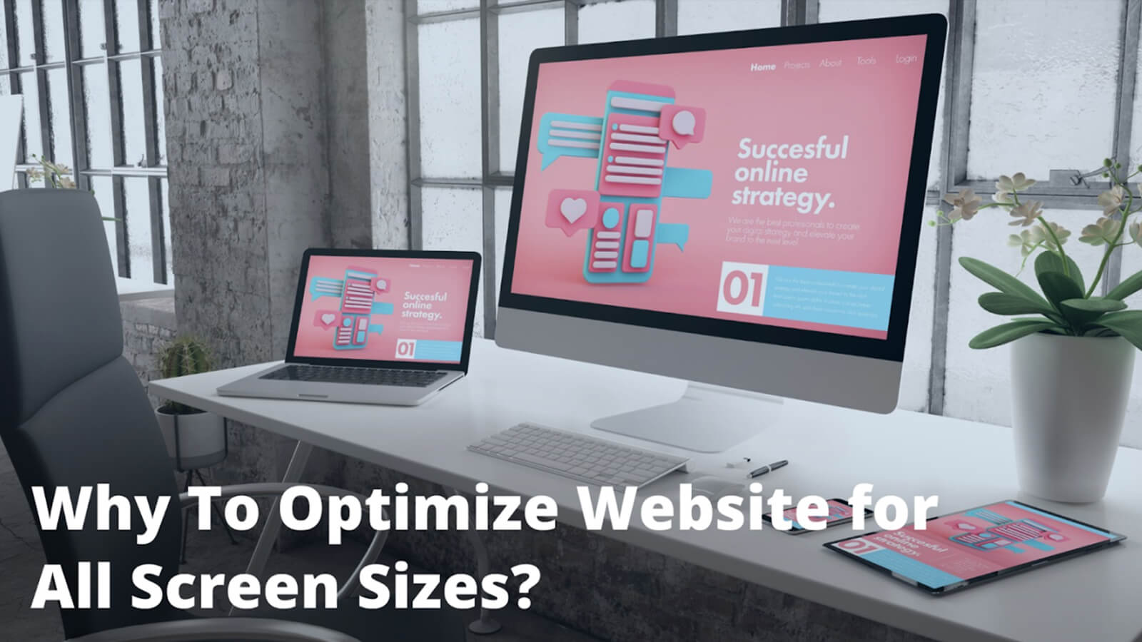
This number is only going to continue to grow in the years ahead. This means that if your website is not optimized for all screen sizes, you are losing out on a lot of potential traffic and business. Here are six reasons why it is important to optimize your website for all screen sizes:
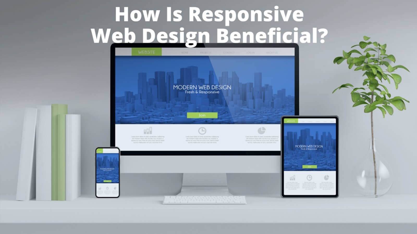
Why it is Important to Optimize Your Website for All Screen Sizes
1. People are using a variety of devices to access the internet
People access the internet from a variety of devices, including computers, tablets, and smartphones. As mentioned, there are now more devices than ever before that people use to go online. This includes smartphones, tablets, laptops, and desktop computers.
If your website is not optimized for all of these different screen sizes, you are missing out on a lot of potential traffic. As a result, it is important to optimize your website for all screen sizes. This will ensure that your website can be viewed properly on any device.
Website optimization can be accomplished in a number of ways, including responsive design and fluid layouts. By taking the time to optimize your website, you will be able to reach a wider audience and provide a better user experience for your visitors.
2. You could be losing out on search engine traffic
Website optimization is one of the factors that search engines take into account when ranking websites. So, if your website is not optimized for all screen sizes, it is likely that it will rank lower in search engine results pages. This, in turn, will result in less traffic to your website.
Therefore, if you want to ensure that your website gets the most traffic possible, be sure to optimize it for all screen sizes. So, if your website is not optimized for mobile devices, you could be missing out on a lot of valuable search engine traffic.
3. Mobile users have different needs and expectations
As more and more people access the internet from their mobile devices, it is important to make sure your website is optimized for all screen sizes. Mobile users have different needs and expectations than desktop users, so it is important to take those into account when designing your site.
For example, mobile users are typically looking for quick, easy-to-find information, so your site should be designed with that in mind. Make sure your content is easily accessible and easy to read on a small screen.
You should also avoid using too much text or cramming too much information onto one page. Keep things clean and simple, and your site will be sure to appeal to mobile users.

Responsive Web Design layout shows on Desktop, Laptop, Tablet & Mobile Screens
4. You could be missing out on social media traffic
More and more people are accessing social media via their mobile devices, and if your website is not optimized for smaller screens, they are likely to bounce straight off. That is why it is so important to make sure your website looks great on all devices. Use responsive design principles to ensure your site automatically adjusts to different screen sizes.
Use clear, concise copy that can be easily read on a small screen. With a little effort, you can make sure your website is accessible to everyone - and that means more traffic and more customers.
5. You could be damaging your brand
If your website is not optimized for all screen sizes, it could damage your brand. This is because potential customers could have a negative experience if they try to visit your website on a mobile device and find that it is not user-friendly. And if they cannot view your website properly, they will be less likely to visit it again in the future.
This could lead them to believe that your brand is out of touch and behind the times. Make sure you are staying ahead of the curve by optimizing your website for all screen sizes. It is the only way to ensure that people have a positive experience when they visit your site.
6. Reduce Web Page Screen Size
Optimizing your website for all screen sizes is more crucial than ever. This practice, known as responsive web design, ensures that your site provides an optimal user experience on any device, from desktop computers to smartphones and tablets. Here are some compelling reasons why it is important:
Increasing Mobile Usage: Mobile internet usage continues to rise rapidly, with more people accessing the web from smartphones and tablets than ever before. If your website is not optimized for these smaller screens, you could be alienating a significant portion of your audience.
User Experience: A website that is not optimized for all screen sizes can be difficult to navigate and use, leading to a poor user experience. On the other hand, a responsive site provides a seamless experience, which can improve user satisfaction and engagement.
SEO Benefits: Search engines like Google prioritize mobile-friendly websites in their search results. This means that optimizing your site for all screen sizes can improve your search engine rankings, leading to increased visibility and traffic.
Improved Conversion Rates: A site that is easy to navigate and use on all devices can lead to higher conversion rates. This is because users are more likely to take the desired action, such as making a purchase or signing up for a newsletter, when the process is straightforward and hassle-free.
Future-Proofing: As new devices with various screen sizes continue to enter the market, having a responsive website ensures that your site will look and function well on these new devices.
Faster Page Load Times: When you optimize your website for different screen sizes, you often improve page load times as well. This can make a big difference for mobile users who might be on slower networks.
Professionalism and Trust: A website that looks good and works well on all devices reflects positively on your business. It shows that you care about your customers' experience and can increase trust in your brand.
So, there you have six reasons why it is important to optimize your website for all screen sizes. If you want to ensure that your website is accessible and visible to as many people as possible, you need to make sure that it is optimized for all devices. This will help you reach more potential customers and grow your business.
Related: Benefits of Responsive Web Design
What is website optimization?
Website optimization is the process of making your website look and work great on all devices, from desktops to mobiles. By optimizing your website for all screen sizes, you will make sure that everyone has a positive experience when they visit your site, regardless of what device they are using. This will help you reach more potential customers and grow your business.
How can I make sure my website is optimized for all screen sizes?
You can make sure your website is optimized for all screen sizes by using responsive design principles when creating your website. You can also test your website on different devices to make sure it looks and works great, and use clear, concise copy that can be easily read on a small screen.
How does website optimization help with SEO?
Website optimization can help with SEO in a few ways. It can help improve your website's visibility in search engine results pages (SERPs). Website optimization can help you achieve better click-through rates (CTRs) from SERPs. It can also help improve the user experience on your website.
 Written By: Khurram Qureshi
Founder & consultant of DigiPix Inc.
Call or text: 416-900-5825
Email: [email protected]
About The Author
In 2005, Khurram Qureshi started DigiPix Inc. which started off as a design agency offering video editing to professional photography, video production & post production, website designs and 3D Animations and has now expanded towards online marketing and business consultancy. Khurram Qureshi also is a motivational figure and participates in local and international platforms. He also play a role in the local community development, helping local young minds get ready to enter the job market.
Related Blogs
More and more people are using mobile…
As technology advances, more and more…

It's no secret that the world of web…

WordPress is one of the most popular site…